The goal of this project was to create a easy going and fun logo for KarlaRod Photography. The top 5 highlights that will determined a success for the brand's visual identity: (Aesthetically pleasing. Fun/Playful. Relatable. Passionate. Personal).
The brand mark needed to include a rose and carnation. These flowers represented the client's two children and their corresponding birth flowers. They were the sole reason why the client continued her career in photography so they represent a strong foundation within her business. The color palettes will consist of nudes, browns, and peach colors. The font will consist of a more playful font direction like loose sans serifs, scripts, and brush fonts. The goal is to stray away from typography that is too serious and corporate looking.
The goal of this project was to create a easy going and fun logo for KarlaRod Photography.

We explored a variety of different directions, experimenting with different ways to communicate the brand attributes (Aesthetically Pleasing, Fun/Playful, Relatable, Passionate, Personal) and translate it in an organic, fun, illustrative logo mark.
We constructed a custom free form illustration of a rose and carnation that uses a diamond shape to bring the two elements together.
In order to create a clean-looking logo, We used grid lines to make sure everything was balanced, proportionate, and geometric. From the brand mark to the custom logotype, this made sure to create a balanced and cohesive visual identity.


Something that is subtle and clean enough to be able to apply it to a wide range of different applications such as business cards, hang tags, and watermarks.

We wanted a typography pairing that was beautiful and expressed the character of the brand, for our headers and subheads we paired a textured serif with a hand-drawn script combination.


The client wanted her brand to incorporate a nude, earthy palette. We explored different variations of gold, tans, and terracotta to bring out the character of the brand.

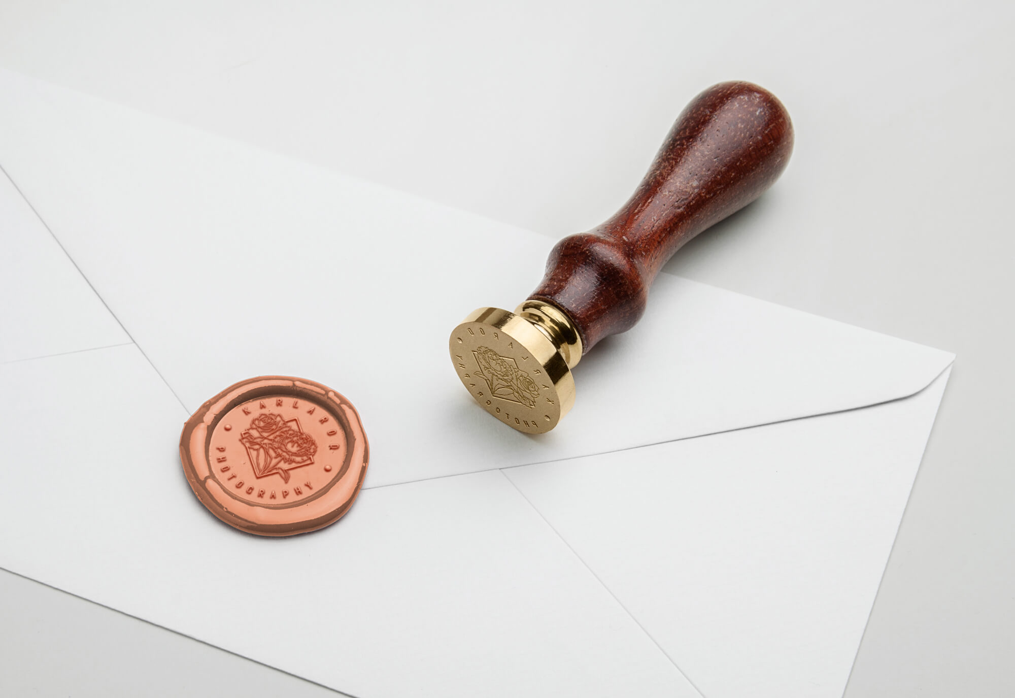
In order to showcase how the visual identity we created would live in the real world, we created a series of digital mockups on a variety of products. These mockups range from cards, tote bags, tags, and stamps.


This is an introductory few sentences to introduce the results of the project. This is an introductory few sentences to introduce the results of the project.
We created and activated campaigns that included creating organic social posts, running social ads, activating an influencer collaboration and daily campaign management. Over an 11 day period our Valentine's campaign garnered over 240 entries. Through these efforts, we were able to inform and reach out to a younger demographic, gain engagement and following on Sizzler’s social platforms, and increase foot traffic to Sizzler locations.


